
ABOUT:
A24 is an American independent entertainment company that specializes in film and television production, as well as film distribution. It is based in New York City.
GOAL:
To create a memorable identity for an Independent (Indie) Film Production Studio, that creatively but concisely captures the attitude of the studio.
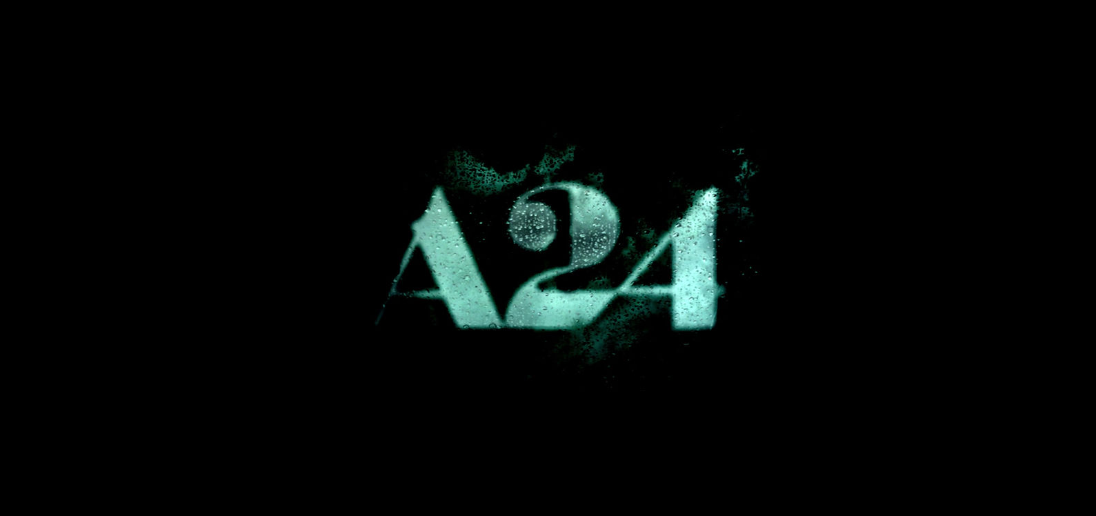
FINAL ANIMATION

WIDESCREEN
DIRECTIONS:
This led me to the directions Moby Comic and Secluded. The Moby Comic focuses on tactile elements, where the Secluded direction focuses on a mixed media approach.
DIRECTION 1: MOBY COMIC

APPROACH:
Tactile
IMAGERY:
For my first direction, I wanted to use a tactile aproach. Moby Dick plays an important role in the film as Charlies favorite novel as well as being a metaphor for how he lives his life. I wanted to open the film with these comic
strips as a way to reference the literary work while also setting the mood without giving the new narrative away.
DIRECTION 2: SECLUDED

APPROACH:
Collage
IMAGERY:
For my second direction, I wanted to use more of a collage aproach. This idea focuses on the emotional turmoil that Charile feels within himself, watching the world turn while he’s stuck behind a window.
CHOSEN DIRECTION: SECLUDED
I liked both of my ideas so I was ready to move forward with whichever direction the client chose. However, I was sad to abandon the Moby Dick comic strips I scanned in from my first idea. The main issue was that the client fearewd it would come of too much like a action movie rather than a psychological drama.
This was a fun challenge in that I had to find the proper videos and overlays that would fit well with the type shape and asthetic. Being able to find a video of rain on a window that was moving but not too stagnant was actually alot harder than I thought it would be. But in the end I was able to find clips that accompanied the logo the way I wanted.
SETTING UP THE STYLE FRAMES:


APPROACH:
Now that I was able to move forward with my first direction, I began to focus on laying out the style frames and prepping them for animation.
THINGS KEPT IN MIND:
The challenge was figuring out the logo would appear on and off screen as well as how I would have the type flash like lightening.
BEGINNINGS OF ANIMATION:

ABOUT:
Once the story was established it was time to layout the masks and overlays in the After Effects file.
Once the story was established it was time to layout the masks and overlays in the After Effects file. One of the main things I had to pay a great deal of attention to was making sure my masks and overlays were in the correct order and opacity. I wanted to make sure the video clips of the rain were visible but that the type was still legible.
FIRST PASS ANIMATION:

NOTES:
For the first round of notes, the major suggestions I received were to remove the moving grain and static background as well as adjust the audio so the audience hears ocean and whale sounds on top of the music bed. In addition to the previous comments, I was asked to adjust the movement of the water so it has more of a water ripple than a shake.
For the first round of notes, the major suggestions I received were to remove the moving grain and static background as well as adjust the audio so the audience hears ocean and whale sounds on top of the music bed. In addition to the previous comments, I was asked to adjust the movement of the water so it has more of a water ripple than a shake.
SECOND PASS ANIMATION:

NOTES:
For the second round of feedback, the main comments focused on adjusting the softness and position of the rain within the logo. In addition to the previous note, another suggestion was to adjust the end audio so the whale call is less quiet.
For the second round of feedback, the main comments focused on adjusting the softness and position of the rain within the logo. In addition to the previous note, another suggestion was to adjust the end audio so the whale call is less quiet.
THIRD PASS ANIMATION:

NOTES:
For the third round of feedback, there were a few tweaks that still needed to be made. The comments consisted of lessening the warping of the water outside of the text as well as blurring it to make the logo pop more. In regards to audio, it was suggested that the whale sound fades more gradually at the end of the animation.
For the third round of feedback, there were a few tweaks that still needed to be made. The comments consisted of lessening the warping of the water outside of the text as well as blurring it to make the logo pop more. In regards to audio, it was suggested that the whale sound fades more gradually at the end of the animation.